
Blog
The Refreshed Home: Before and After Pics Part One
Besides results, The Refreshed Home’s best deliverable in design and listing prep work is peace of mind…. but let’s face it, pictures start the conversation. So welcome to the inaugural version of The Refreshed Home: Before and After Pics.
EXTERIORS
Whether buying, selling, or staying and improving, fresh color and attention to detail are high ROI improvements that add to the value and enjoyment of any property.

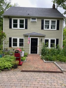
A 1920’s Montgomery Ward Kit house: Historic color was saturated but nuanced, with classic black trim for the win.
Ossining

The two-tone look is dated; brick was painted to match the siding.
Mamaroneck


House was sideways on lot. After architectural updates, we worked on colors and hardscaping. Trellis to the right (below) created an entry, and pointed the way to the main entrance.
Croton
Not all improvements are big-ticket items. This seller added a lot of value with $300 worth of black shutters.
Mahopac


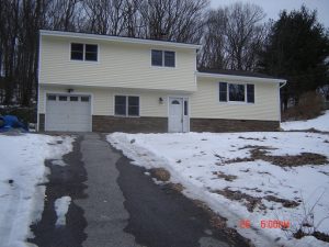
Stronger colors, more/wider trim gave this 1960s house a fresh look with more character.
Chappaqua


Railings on front/side porches were needed to bring it up to code.
Painting them white visually extended the footprint, adding more value to this impressive house.
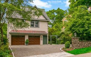
Rye


Adding a porch, wider trim, and a deeper contrasting body color updated, and extended this property’s more modest footprint.
Croton-on-Hudson


A color with oomph made this highly visible corner-lot house bigger, more impressive, and more valuable to buyers.
Hastings on Hudson

DESIGNING VIRTUAL STAGING

Unusual house in rural setting. Defining placement, showing context, and getting the styling right was critical to attract the right buyer.
North Salem
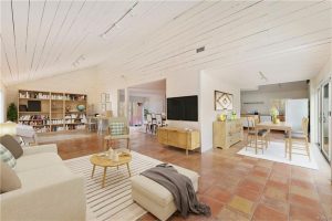

Fresh, bright paint was easy. Oversize LR had an unusual traffic pattern, illustrating a floor plan was necessary to demonstrate value.
Hastings on Hudson

DESIGN IMPROVEMENTS
Cortlandt Manor

Small and constricted entry in a large bright house. Opened the wall to let space breathe.


It’s always a basement when there are poles in the middle of the space. Making it a wall elevated the space, defined upholstery placement, and provided electric source.

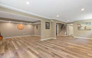
You can see light coming in, but full wall on left closed-in, and darkened space.

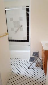
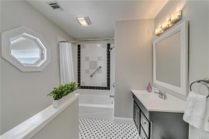
A knee wall opened space, kept privacy. Fresh wall color, painting vanity glossy black updated and complimented existing tile.

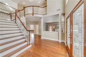
This entry was awash in 1990s details: Over-embellishment, golden oak overload, dueling finishes.

Sheet-rocked over knee wall, painting cap, simpler fireplace surround, and more unified finishes updated this home, and created a welcome and serene space.
Croton-on-Hudson
Stay tuned for more of The Refreshed Home’s Before and After Pics.
For more info and ideas subscribe to our newsletter. All original content, no pesky ads or spam. REALLY!