
Blog
Design Trends (So Far) for 2019
The Thanksgiving turkey was not yet picked clean when the first announcement landed, and they kept coming: paint companies and color forecasters’ picks for their 2019 Color of the Year.
Since then, those of us in the design trade have seen a steady stream of sneak peeks from the upcoming slate of spring design markets and trade shows. Trends and fads come from real places, one of them is we like to see new things, so the industry certainly has our attention!
But why keep them under wraps? There’ll be more in the days ahead, but here are the top 10 I’ve seen so far. Distinct yet mutable, notice the overlap? LMK your yays and nays!
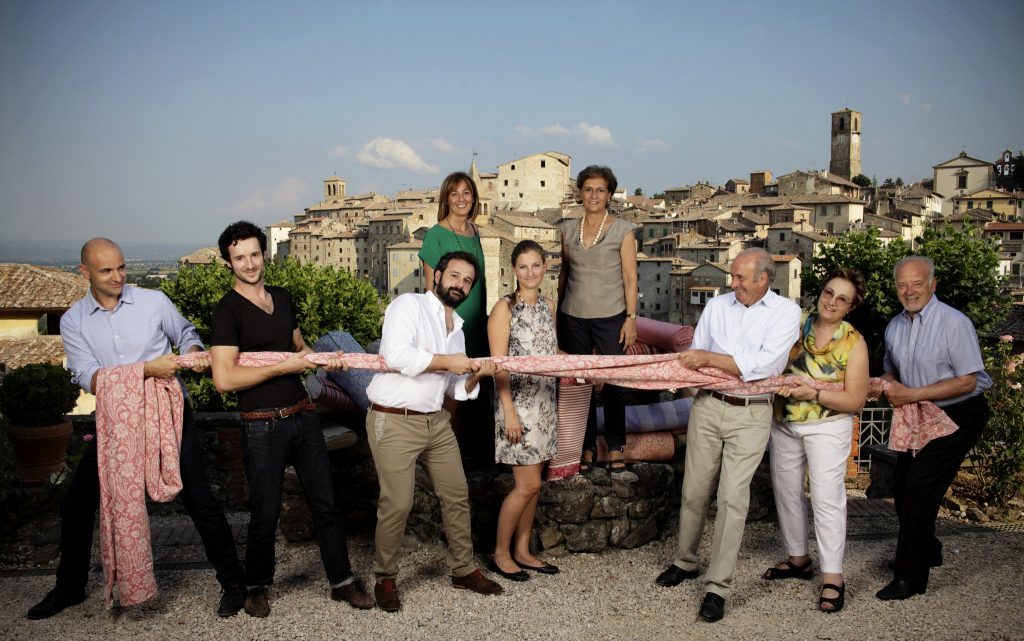
Artisan: Anything with history feels more substantial, more valuable; things made by hand imbue a feeling of being cared-for. The House of Busatti in Anghiari, in the Tuscan region has woven quality textiles since 1842. Using “….natural fibers, and designs that are the heart and soul of the Renaissance, and its rustic traditions….” Ahhhhh, yes….
Polish: Like craftsmanship, it’s more about a fineness, or level of completeness than actual sheen. This channel-pleated leather sling chair below, from Howard Elliot checks so many of the boxes, I just love it.


Real: Anything forced or over-engineered is just too much work. Uncomplicated and authentic, perhaps handmade or reminiscent of faraway lands like the above mosaic pendants from Surya feeds our wanderlust.
The turquoise-embedded bath tiles get an Honorable Mention. Being surrounded by great energy and powerful healing every morning is a great way to start the day!

Saturated color: We still like gray and grayed tones, but crave the richness of deeper, nuanced tones with character. BONUS: they can be integrated seamlessly with our afore-mentioned grays.

IMO Pantone’s Living Coral missed the mark, my votes go to the deeper blues like BM’s Adriatic Sea or Down Pour Blue; and blues into greens: Nightwatch by PPG (Pittsburg Paints), and (a surprise) Blueprint from Behr.
Organic: Anything that had roots, or came from Mother Earth speaks to our cells . Movement brings life and joy, this clay sculpture is a two-fer.

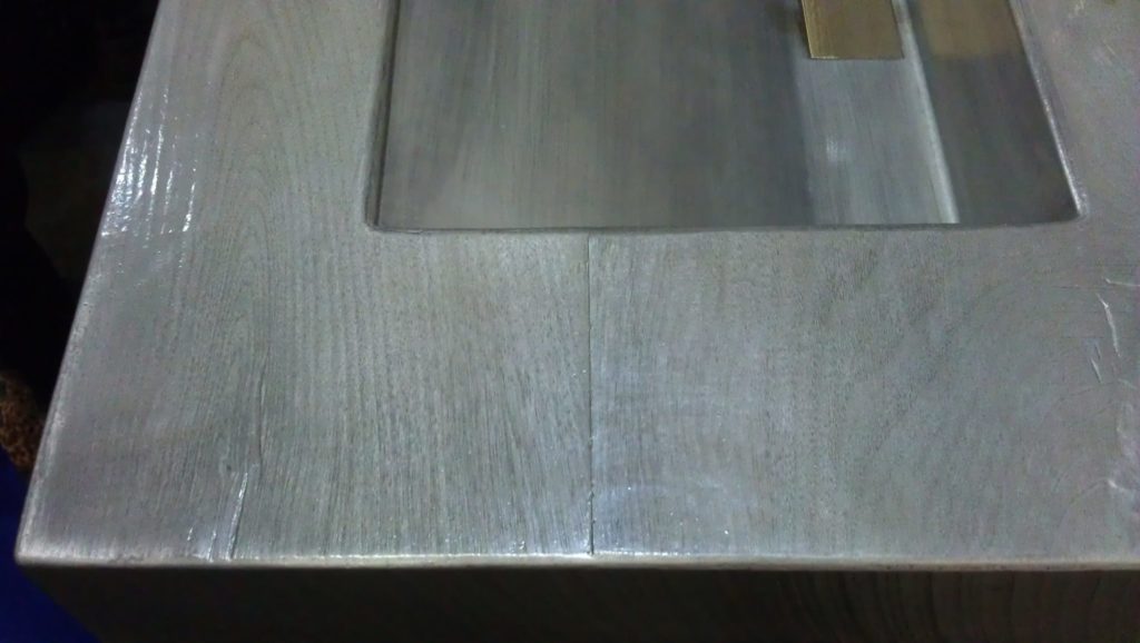
Juxtaposition: Familiar materials being used in unexpected ways can be eye-catching, green, economical, practical and even fun. This concrete vanity top has a sleek urban look…but take a closer look, you’ll see a subtle wood-planked effect.

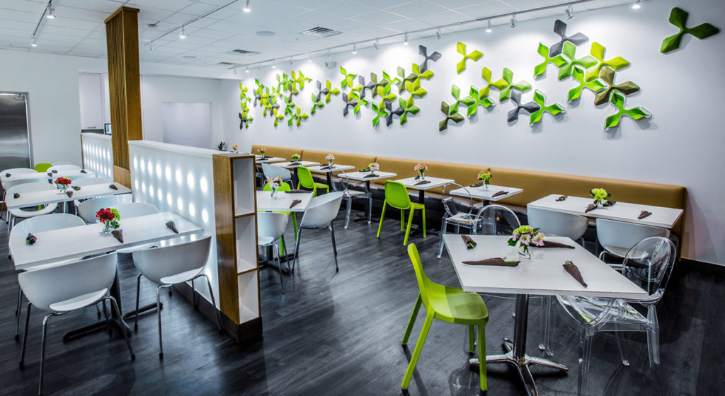
Whimsy: Our days, our lives are serious. The right art, or a can go a long way to lightening up home, or the office (our other home). Ecoustic Foliar by Unika Vaev is a felted/textile commercial product, but certainly suited for any bright and oversize modern space. Shown here in Asian Mint, a Dallas restaurant. Honorable mention, this free-form ceramic tumbling jack installation.

Satisfaction: You know this feeling. Design and products that combine complete comfort to the senses, and solid function just make you happy, like this DR set from Sunpan furniture.

Harmony: Really good design-like really good jazz-does not need hard work to be understood. As shown in this water sculpture, the elements may be very different, but together, they complement each other in some way, it’s just there to be enjoyed.

The trade shows start in earnest in March…stay tuned, I’ll keep you posted!